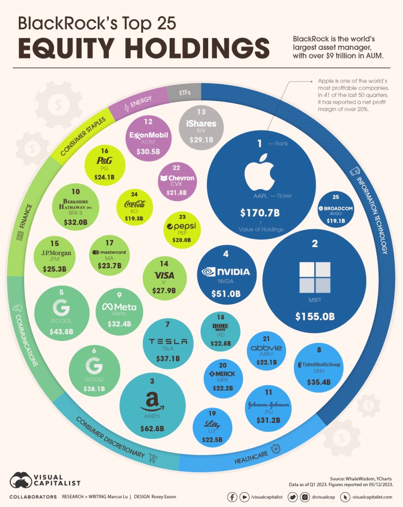
A simple graphic that is easy to understand. The size of the circles represents the size of the companies. And the colours sort the companies into sectors. Particularly appealing: the legend is placed as a circle around the circles.
Found here: https://www.visualcapitalist.com/blackrocks-top-equity-holdings-2023/
